Starting tomorrow, April 21, 2015, your website needs to be responsive. Google announced that "mobile-friendliness" will start factoring in their website ranking algorithm tomorrow. Unless you want to see a dip in your rankings, getting a responsive website needs to be high on your todo list over the coming weeks or months. And really, regardless of what decisions Google is making, having a responsive website is a good idea because mobile web surfer accounts for somewhere between one third and one half of all web traffic.
Of course, it's all well and good to say "your website needs to be responsive," but you might have some additional questions. Let's take a look at a few of them and find the answers.
- What does "responsive" mean?
- How do I know if my website is responsive?
- Where can I get a responsive theme?
That's all easy enough. Let's go.
What Does Responsive Mean
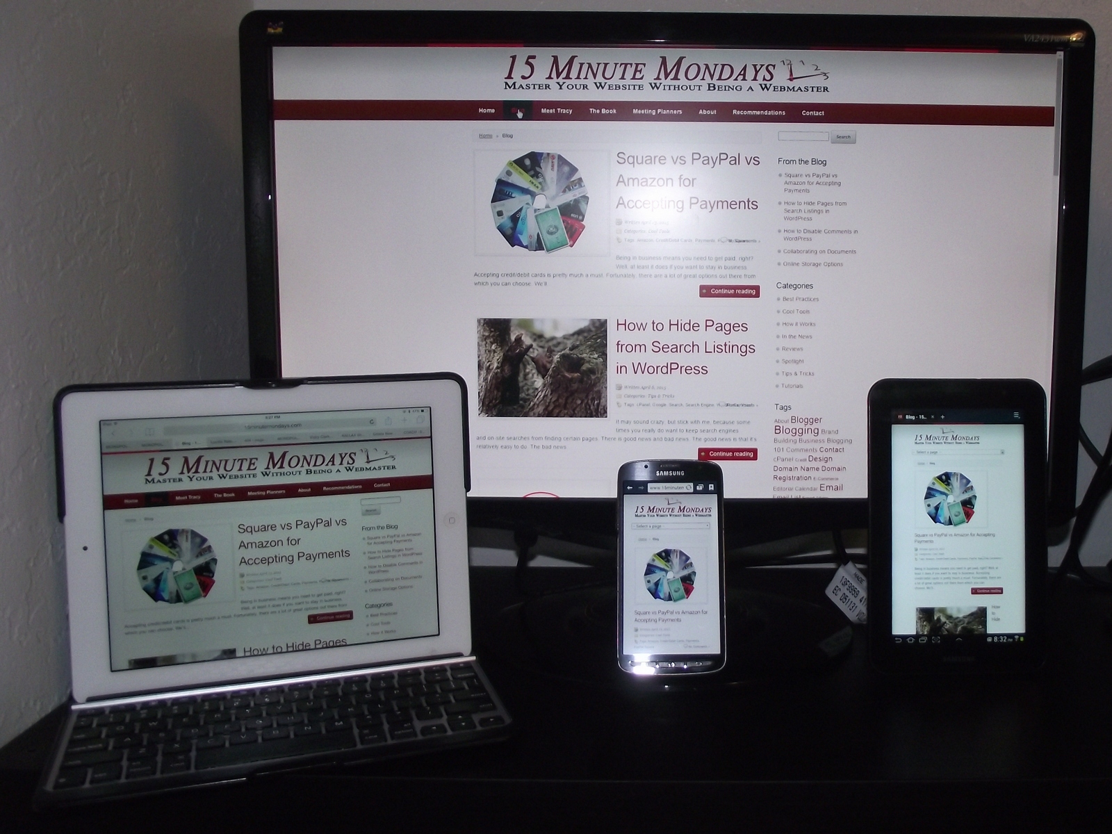
Responsive web design is about making your website adapt itself to the size of the viewer's display. Years back, when mobile devices first started getting on the internet, designers would make a regular website and then a completely different mobile website. Maintaining both of these was a royal pain.
A responsive website, however, adapts itself to the size of the screen. Mobile and regular aren't the only choices. Now there are lots of little variations all inbetween a small mobile device and a wide screen desktop display.
Coding a mobile display might be a bit tough, but if you're using WordPress, Blogger, or some other website engine, they'll usually handle most of the heavy lifting for you. You just might have to tweak a few graphics to make it all work.
How Do I Know if My Website Is Responsive
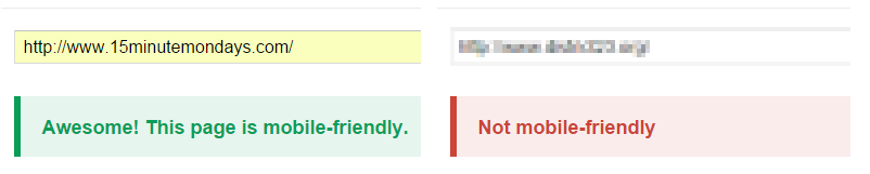
There are several ways to test your website for responsiveness. The first is, naturally, from Google. Their Mobile-Friendly Test gives you a quick yes/no answer to the question of whether or not your website is responsive in design. Obviously, I blurred out the website that was not mobile friendly. Let's just say that it belongs to a friend of mine who I've been trying to convince to go responsive for a while. I'll make sure to send him this post. He'll like that. 🙂
The next option doesn't tell you if it is responsive or not. However, is does something pretty cool. Responsive Design Checker from Media Genesis shows you what your website looks like at different display resolutions ranging from a 27" WQHD (widescreen quad high def) monitor to an iPhone in portrait mode and eight other options in between.
I suggest you check the yes/no answer from Google first and then take a look at your website through the Responsive Design Checker to see if it's rendering okay.
Where Can I Get a Responsive Theme
If you're a Blogger user, Blogger is responsive by default. However, applying a custom template (their word for theme) might have undone that. Check your website using the links above, but I bet you're going to be just fine.
For WordPress and other CMS' (content management systems,) look for themes that say "responsive" on them. Most new themes that are coming out are responsive. Not all, but most. Older themes, especially the free ones, were not.
One of my favorite sources for WordPress themes is Elegant Themes (* affiliate link.)
The Quick Takeaway
Switching to a responsive theme is quick and easy. Well, it is if you have one of the major CMS platforms (WordPress, Blogger, Joomla, Drupal, etc.) If you have a hand-coded HTML website, you might want to upgrade for other reasons beyond just becoming responsive.
So, tell me, is your website responsive? And what's your favorite WordPress theme or Blogger template? No judging, of course, I'm just curious.